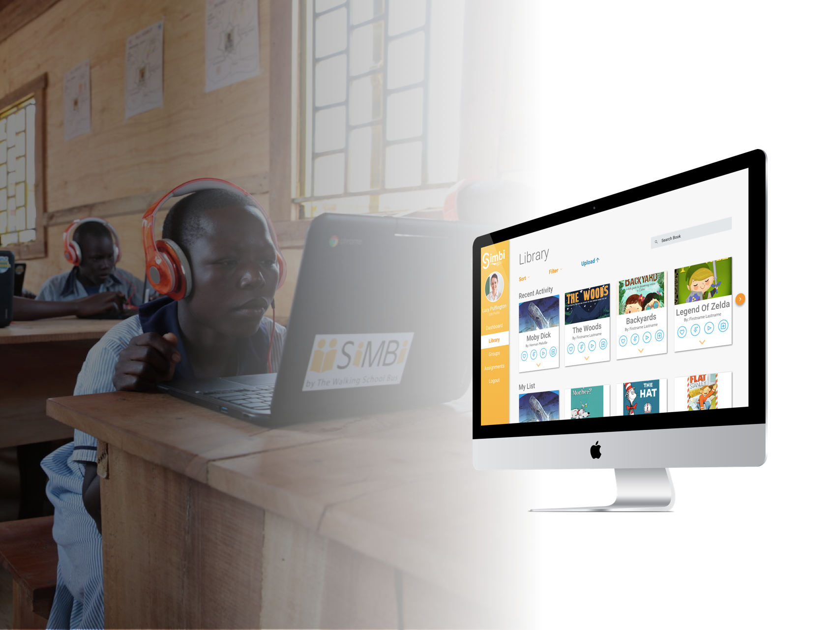
SiMBi is humanity’s power
in progressing literacy
SiMBi Web App
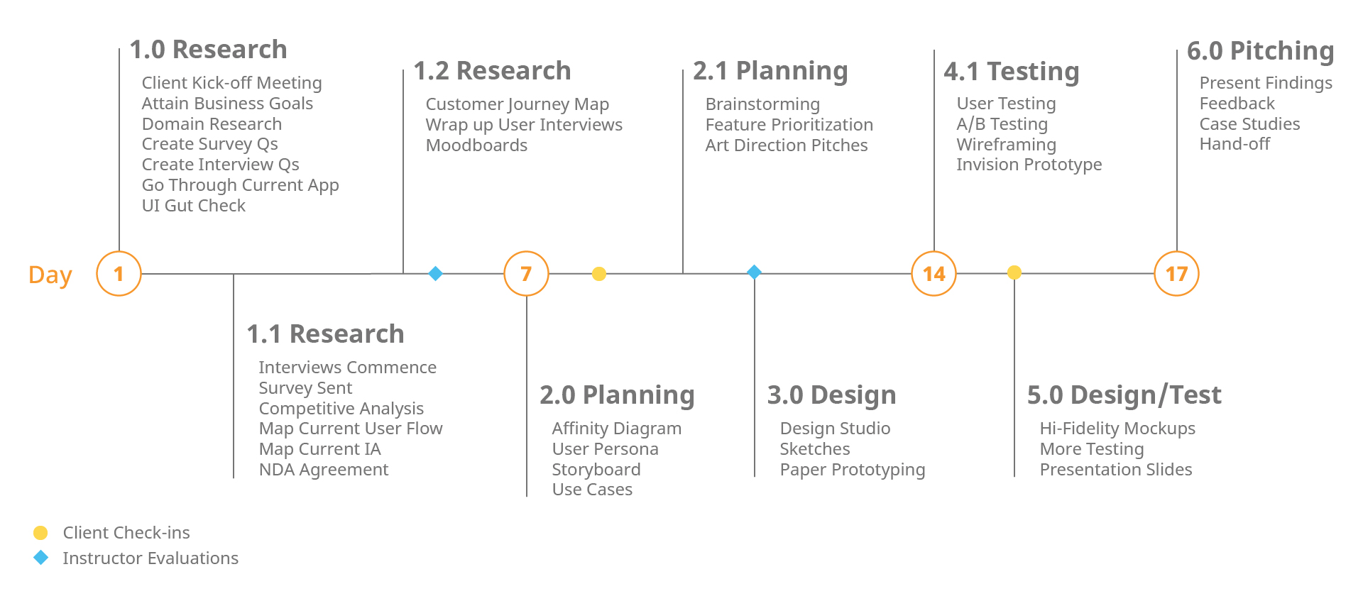
Timeline: 2.5 Weeks
Role: UX/UI Designer
Tools: Sketch, Invision, Illustrator
SiMbi is a peer-to-peer reading program that improves student literacy and gives teachers time-saving insights.
View Prototype Read Full Case StudyOverview
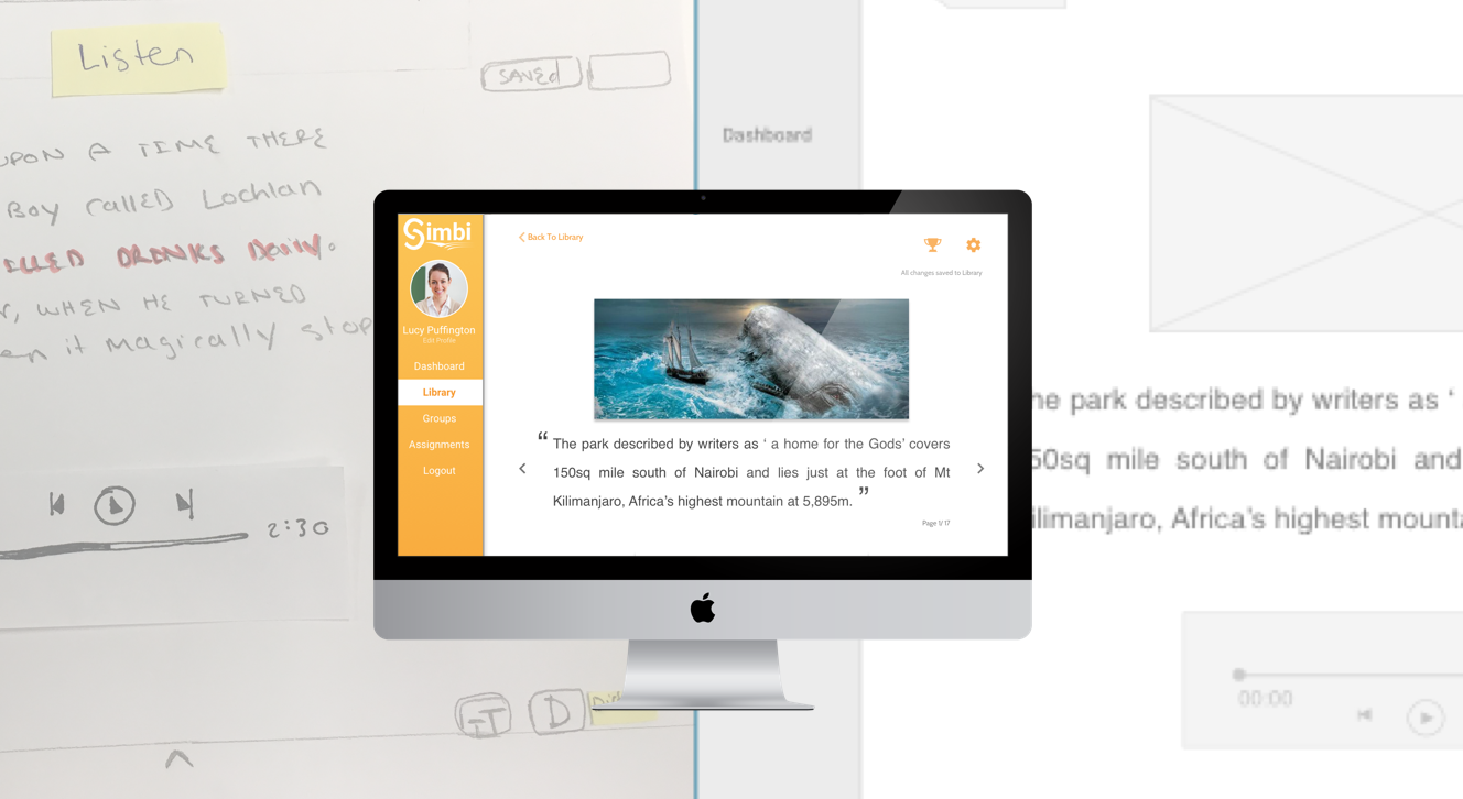
Our client had asked us to take a look at improving the UX and UI of their existing web app and suggest improvements of its core functions of recording and listening while reading. Addditionally, they had also wanted to evolve the organizational functions as well as overall branding. From our client’s expressed business goals, we decided to make our priority in the teacher’s perspective rather than the student as SiMBi as a business is targeting teachers and educational institutions to expand their customer base.
Process
Objective
From our client’s expressed business goals, we decided to make our priority in the teacher’s perspective rather than the student as SiMBi as a business is targeting teachers and educational institutions to expand their customer base.
Our research revealed that:
- It takes a considerable amount of time doing assessments
- Peer/group reading sessions are usually the most effective
- By giving kids autonomy over their reading they are more motivated to read
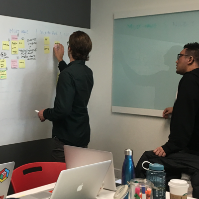
From a user’s perspective, the top three opportunities we found were:
- How can we make it easy for teachers to manage their attention more easily and effectively with their students?
- How can readers be more engaged while reading so they are motivated to keep reading?
- How can we create this platform so that teachers can adapt it to their varying needs?
Challenges
The biggest challenge for me was the fact that the project had a very wide scope in terms of potential users. It was a challenge to focus only on the MVP because there were so many factors from the student and teacher perspective that we had to address, even if we did not build it out.
Additional considerations:
- 2.5 week time frame
- Stretch goal tackling the UI despite limited experience
- Trying to provide immediate value to teachers so that the technology could be more easily adopted
Outcomes
- Was able to create the teacher flow that would help provide immediate value and help the adoption process
- Used Google's material design as a guiding principle due to context
- Gather useful insight into the evolution of the education system in BC
- Attained our stretch goal of creating hi-fidelity mockups for our client
Our client was incredibly happy with what we were able to accomplish and took our findings to develop them further.
Seriously impressed with your work! We feel very fortunate to have had the chance to work with you!
Aaron Friedland, CEO