Skilled trades are closer
than you think
LincEdge Responsive Website
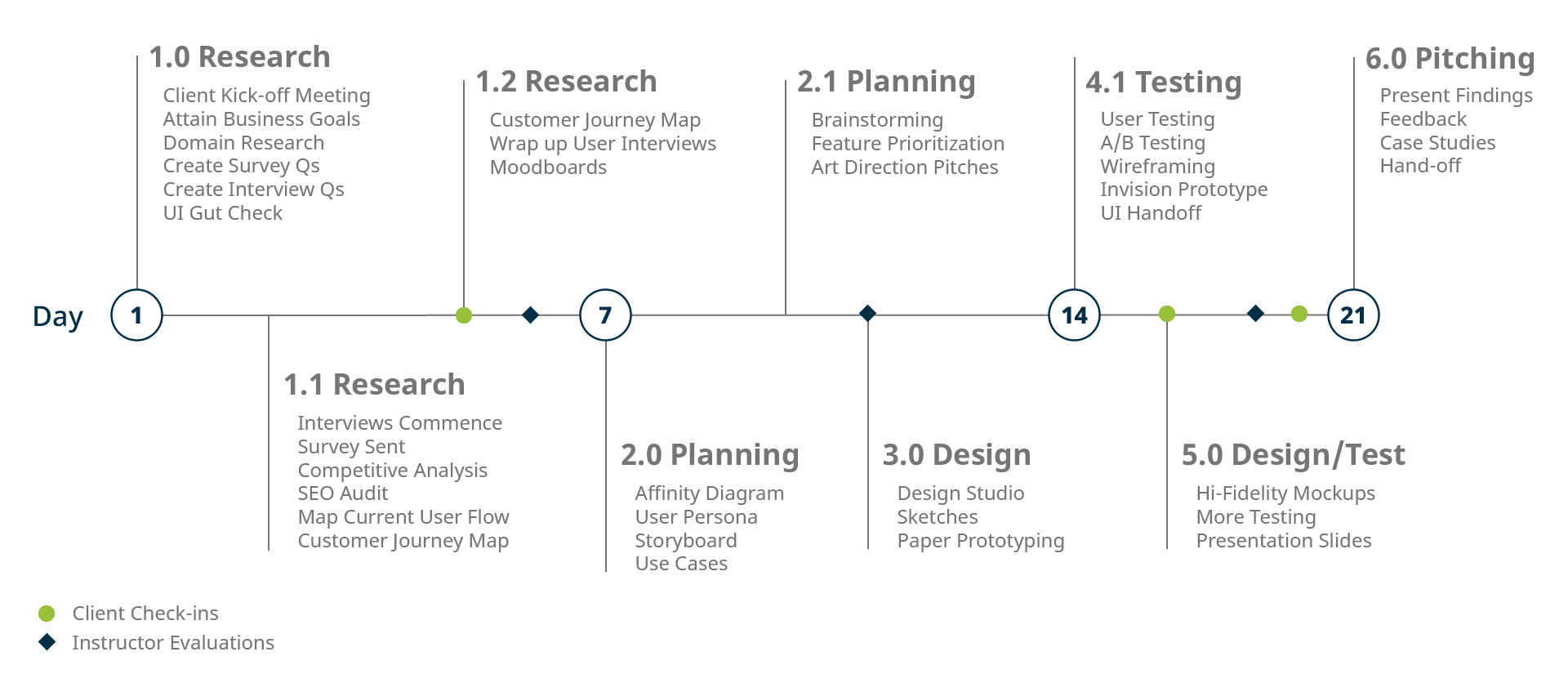
Timeline: 3 Weeks
Role: UX Designer
Tools: Sketch, Invision
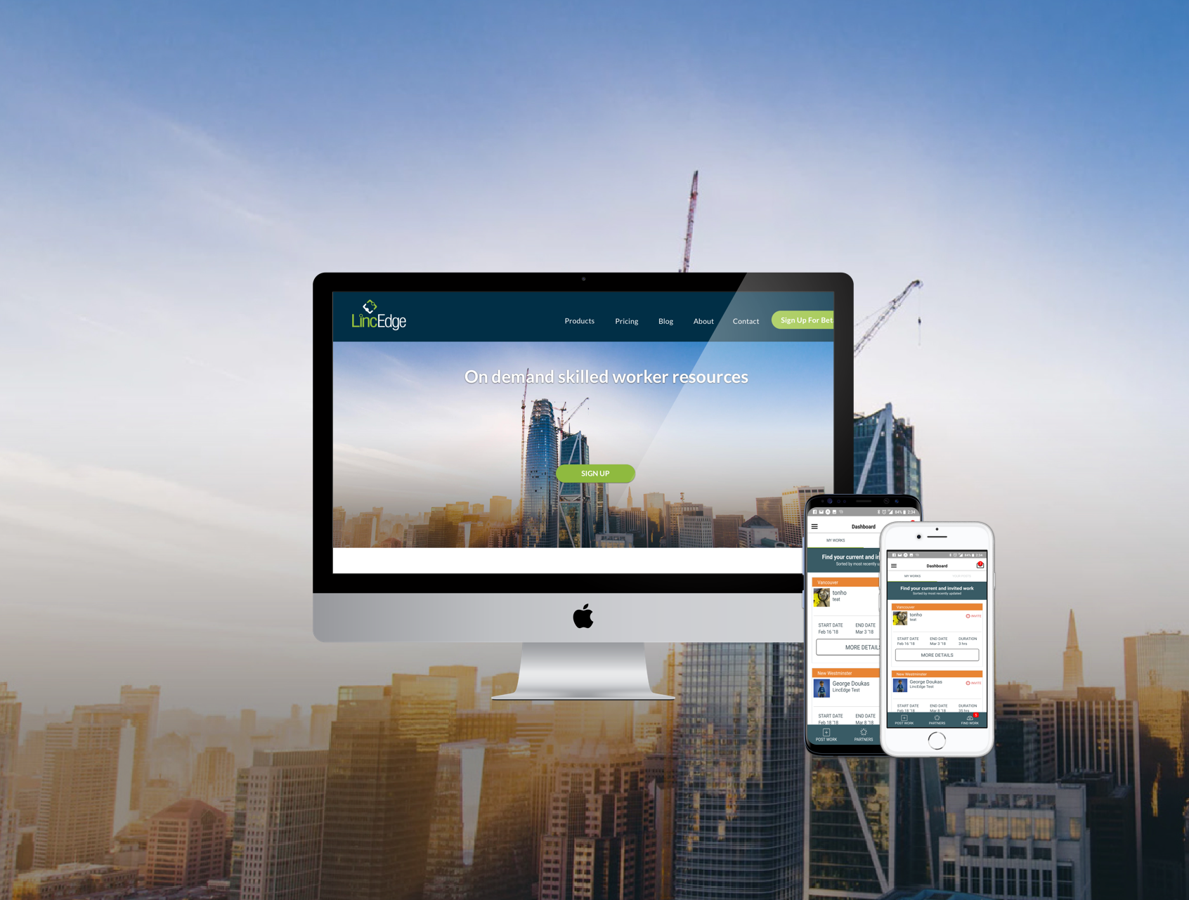
LincEdge's goal is to allow independent contractors and owners to share capacity, offering their services when idle, and sourcing labour when in peak demand, optimizing efficiency across the board.
View PrototypeOverview
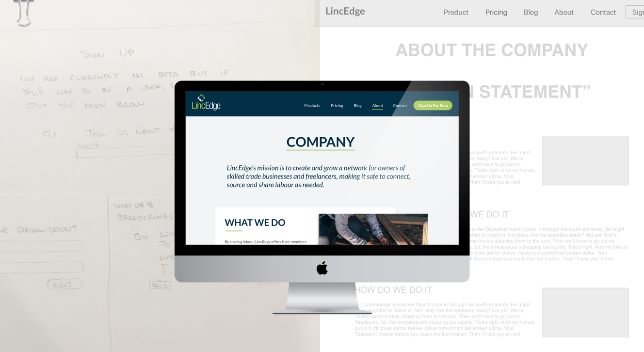
LincEdge’s mission is to create and grow a network for owners of skilled trade businesses and freelancers, making it safe to connect, source and share labour as needed. Our client had a website which was currently hosted through Wix. The main pain point of our client felt they had was that their website ineffective at in communicating their value to potential customers.
Process
Objective
From our client’s expressed business goals, we decided to make our priority in the teacher’s perspective rather than the student as SiMBi as a business is targeting teachers and educational institutions to expand their customer base.
Our research revealed that:
- There was not enough content on the site to explain LincEdge's value to users
- Users did not trust the site because they felt it looked inauthentic
- Users were unsure if the app was for business owners or for regular employees
- It felt like the app was already out when in fact, was still in Beta testing, which frustrated users
From a user’s perspective, the top three opportunities we found were:
- How can we gain the trust of our target users?
- How can we keep them engaged so that when the app is released, they will be more inclined to download it?
- How can we communicate LincEdge's value to its users in a more effective way?
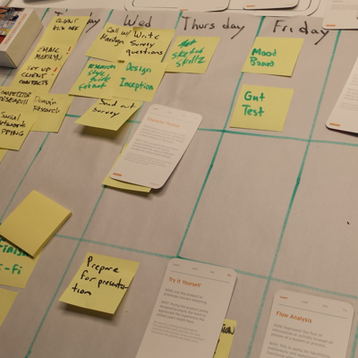
Challenges
Our main challenge was that we had a very specific target user. As a result, it was difficult to secure a large number of interviews in the given amount of time. To compensate, our team looked at other means of statistics to get a better picture of the overall landscape.
Additional considerations:
- Client was strongly set in their current branding
- Stretch goal tackling the UI despite limited experience
- Trying to provide immediate value to teachers so that the technology could be more easily adopted
Outcomes
- Built both web and responsive hi-fidelity screens
- Project was selected to be developed by the web development team
- Client resonated with our research findings and felt that the core needs had been addressed
Our client felt that it was a huge improvement to their original site and were excited that the project was able to move to the next stage.
